
The highly anticipated Dulux Colour Awards have reached a significant milestone, celebrating 40 years of recognizing excellence in colour usage across architecture and design. The winners for the 2026 edition have been officially announced, showcasing a remarkable array of projects that push the boundaries of colour application.
A Celebration of Colour
A select group of extraordinary projects across ten distinct categories were honored by a panel of leading design professionals. Lauren Treloar, Dulux colour and design manager, emphasized the central role of colour in the winning entries. "For forty years, we have highlighted the potential of colour to transform architecture and design, and applauded those who most masterfully employ it to enhance our user experience," Treloar said. She further noted that the awards are unique in the design industry for recognizing colour as an integral design tool.
Residential Categories Shine
In the residential categories, the winners demonstrated a confident departure from traditional palettes and applications. The use of colour-drenching techniques and nods to modern nostalgia elicited strong emotional responses from the judging panel. Many projects featured bold, warm shades that achieved visual saturation, creating immersive environments.

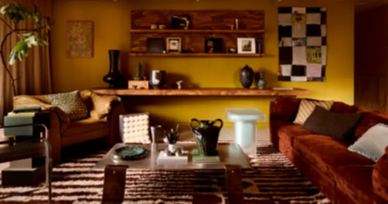
The winner of the residential interior category is The View by Studio Shields, located in the Yarra Valley, Victoria. Designer Ruby Shields explained that the project was a seven-year reimagining of a home nestled in the treetops. "Colour forms both the emotional and architectural framework of the interiors," Shields said. "Developed in close dialogue with the surrounding landscape, the palette draws from oxidised earth, eucalyptus canopy, dry grasses and shifting skies, allowing the interior to feel inseparable from the landscape."
Shields detailed the specific hues used: chartreuse and olives heighten the natural green of the bushland beyond the windows, while burgundy and earthy reds ground intimate zones, echoing the soil and the unique beauty of aged timber. "Powdered electric blues temper warmth and introduce clarity," she added. "These subtle shifts build a tonal narrative, so movement through the home unfolds as a considered journey."
Industry Recognition
The awards continue to serve as a benchmark for design excellence, highlighting the transformative power of colour. The 2026 winners exemplify how architects, designers, and students can step away from conventional approaches to create spaces that resonate emotionally and aesthetically.