
This week's edition of The Crunch newsletter delves into a variety of topics ranging from the disappearance of Australian accents from music charts to mouse plagues and oil drilling in the United States. Here is a summary of the key stories featured.
Where Did All the 'Strayan Accents Go?
On Monday, a deep dive into the Aria charts revealed a massive decline in the number of Australian artists over 37 years. The analysis showed an increase in older and repeatedly featured songs, along with significant changes in dominating genres. An interactive feature allows readers to explore the charts by artist, country, and genre, while a quiz tests knowledge on the subject.
AI Boom Explained in Six Charts
Another article tracks the rise in costs, spending, capability, and resources involved in the AI push, providing a clear visual explanation of the current AI boom.

World Cup Predictions and Underdog Victories
With the World Cup approaching, readers can predict a path to victory and explore the biggest underdog victories from previous competitions, including France 1998 and Germany 2006.
Five Charts from the Fortnight
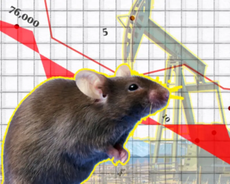
1. Mouse Plagues in Australia
The population of mice in parts of Australia has reached plague levels, with more than 800 mice per hectare in some areas, and up to ten times that in farming communities. These plagues damage crops and farming equipment, exposing people and pets to disease and pesticides. An animated visualization from the ABC illustrates the scale, and a previous plague in 2021 caused an estimated $1 billion in damage.
2. Oil Drilling in the United States
A story from US colleagues maps oil drilling sites in one Colorado county. Green dots indicate companies that provided financial collateral for cleanups, while reddish-brown dots represent plugged wells where cleanup was never completed.
3. Pacific Region's Vulnerability to Oil Crisis
The Pacific region is particularly exposed to the oil crisis, with some countries relying on oil products for up to 80% to 90% of their electricity. The rising cost of oil pushes up prices for food and other basic goods, exacerbating economic challenges.
4. How Traffic Lights Work
An explainer from PerThirtySix covers the history and mechanics of traffic lights, from the first light in the 1860s to the use of red, yellow, and green. Animations illustrate different detection systems, and the site also features visual explainers on solar panels and GPS.
5. The Real Culprit for Entry-Level Job Decline
While AI is often blamed for killing off entry-level jobs, a paper suggests remote work as an additional culprit for the early-career hiring slowdown. This perspective challenges the common narrative.
Bookmarks
- A free course on data feminism
- How long is a river?
- A story about racial profiling by ICE in New York and New Jersey
- How noise affects Rice's whales in the Gulf of Mexico
- Why do rich countries do better in women's football?
Off the Charts
A story from The Pudding about K-pop and its history, told from a first-person perspective by Minji Kim and Eunice Lee, offers a unique insight into the genre's rise.
Enjoying The Crunch? Forward this email or share the sign-up link with others who might enjoy it.